At 9:17 on a Tuesday night, a parent opens her phone.
Let's call her Maya. She is not one particular customer...she is a composite of the buying situations swim schools encounter every day.
The dishes are finished. Her six-year-old is finally asleep. On Saturday he jumped into a friend’s pool, panicked, and grabbed the nearest adult. Nobody was hurt. Maya has been replaying it ever since.
She types swim lessons near me.
Three schools appear. One has a recognizable name but no prices. One asks her to submit a contact form. The third looks promising, but its registration page opens into a wall of class codes, levels, dates, instructors, and red “FULL” labels.
Maya is not casually browsing. She is motivated. She has a child, a reason, a credit card, and a quiet ten-minute window.
And still, no booking happens.
For a cold lead, your website is the closest thing your business has to a résumé.
A warm lead can borrow confidence from the person who referred her. Maya cannot. She has no history with the owner, no relationship with an instructor, and no reason to assume the promises are true. She has only what the business allows her to inspect.
That makes the website the number-one trust asset to optimize for cold traffic. An advertisement can win attention. A social post can create familiarity. A search result can earn a click. But the website is where those fragments are finally judged together.
A conventional résumé has to prove that a candidate is credible enough to deserve an interview. A business website has a harder assignment. It must prove three things at once:
- Trust: This is a real, capable business I would allow near my child.
- Value: The result being offered is worth the price, time, and commitment.
- Fit: This specific program works for my child, location, schedule, and situation.
Then it must do what a résumé cannot: make the next step obvious and safe.
That is why this is Part 1 of Optimizing Your Digital Footprint. Before expanding reach through search, social media, partnerships, or ads, the place all that attention eventually lands must be able to carry its weight.
This is the mistake most website projects make: they begin with colors, navigation, and a homepage headline. The real project begins one moment earlier—with the story inside the buyer’s head—and ends one moment later, when that buyer knows exactly what will happen after pressing the final button.
A beautiful swim school website can fail that journey. An ugly one can occasionally survive on reputation. The website that compounds growth does something more difficult:
Your website is not an online brochure. It is your digital résumé, your first sales conversation, and the first test of whether your operation deserves trust.
This is how to build that website.
The sale begins before the website
A parent rarely arrives as a blank slate. She brings a recommendation, a fear, a calendar problem, a price expectation, and several half-remembered encounters with your name.
Marketers draw funnels because funnels are measurable. A thousand search impressions become eighty website visits. Eighty visits become twelve booking starts. Twelve starts become six purchases. Each narrowing gives the operator a place to investigate.
Human beings do not move so neatly.
Google’s consumer research calls the space between a purchase trigger and a decision the messy middle: people loop between exploration and evaluation, touching different sources in different orders. That research spans consumer categories rather than swim lessons specifically, but the principle maps cleanly onto a local service. Read Google’s purchase-journey research.
Maya may have heard your name on a pool deck in May. She may have ignored an Instagram post in June, noticed your logo on a neighborhood sponsor board in July, searched for you in August, and returned directly two nights later after checking the family calendar.
Analytics may credit the last direct visit. Her memory credits the whole sequence.
That is the first job of the website: be the place where every earlier exposure finally makes sense.
When Maya arrives, she is silently looking for continuity. Is this the same school her neighbor mentioned? Does the photography resemble the place she expects? Do the ages, location, and teaching style match the fragments she remembers? A website does not merely introduce the business. It resolves everything the buyer already believes about it.
The funnel still matters
The fact that the journey loops does not make funnel measurement useless. It changes what the funnel means.
Use the funnel to locate friction, not to tell yourself a fictional story about a linear buyer. If families reach the pricing page but never inspect availability, the problem is different from families who begin checkout and disappear at the waiver. If branded searches rise while last-click social conversions remain flat, repeated exposure may be working in a way the final source cannot describe.
Measure the sequence. Respect the mess.
A motivated parent can still be unable to act
B.J. Fogg’s behavior model says that behavior occurs when three things converge: motivation, ability, and a prompt. It is a general behavior-design model, not a swim-school sales experiment. Used carefully, it gives website owners an unusually sharp diagnostic question: what prevented the desired action at the exact moment it was supposed to happen? Explore the Fogg Behavior Model.
The path is not.
Maya’s motivation is high. Ability collapses when the level names make no sense, availability may be stale, the pool address is hidden, or checkout requires a callback tomorrow. The prompt collapses when every button says “Learn more.”
When a motivated family does not act, do not automatically make the headline louder. Ask:
- Did the offer connect to the problem the parent is trying to solve?
- Could the parent understand and complete the next step?
- Was there a specific action available at the moment she was ready?
The website cannot manufacture unlimited motivation. It can stop wasting the motivation that already exists.
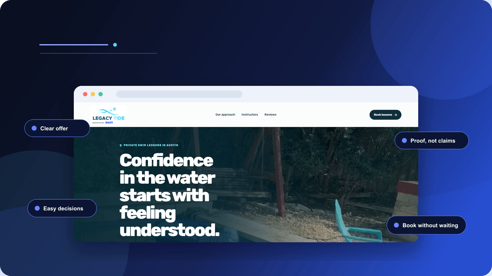
The first screen makes a contract
Before a parent judges your instructors or your philosophy, she asks a faster question: am I in the right place?
The first screen is not an inspirational poster. It is a contract made in plain language.
It should tell Maya what you teach, whom you teach, where lessons happen, and what she can do next. Not eventually. Before she scrolls.
“Building confident swimmers for life” is a lovely sentiment. It is also compatible with almost every swim school on Earth.
Compare it with this:
Private and small-group lessons for children ages 2–12 in North Raleigh. See current openings and book online.
The second version is less poetic and more generous. It allows the parent to qualify the business without effort. The emotional promise can follow:
Patient, safety-first instruction for first splashes through independent swimming.
Now the page has both logistics and meaning.
The four answers above the fold
What is being sold? Private lessons, groups, clinics, recurring plans, or mobile lessons.
Who is it for? The age, level, family, or problem you serve particularly well.
Where does it happen? A real facility, a city, or a defined mobile service area.
What happens next? See matching times, choose a program, or request placement help.
The answers change with the operating model. A mobile instructor should surface travel boundaries, pool requirements, and availability by area. A multi-location school should help the family choose a branch before showing programs. A brand-new independent instructor needs personal credibility and a clear first available date. A large school may need separate paths for new families, returning families, and complex placements.
The principle does not change: specificity lets the right buyer recognize herself.
Navigation should follow questions, not departments
Most navigation is inherited from website templates: Home, About, Services, Blog, Contact. That structure describes the company. It does not necessarily serve the decision.
A parent’s actual sequence sounds more like this:
Do you teach a child like mine? Can we realistically attend? Who will teach? What will it cost? Which lesson is right? What happens if we miss one? Can I book now?
Those questions should be visible in the architecture. If the same uncertainty appears repeatedly in texts, calls, and DMs, the website has already told you what page or explanation is missing.
Trust is assembled, not announced
A parent is not buying thirty minutes in water. She is transferring responsibility for someone she loves.
That is why generic trust language feels so empty.
Safe. Fun. Professional. Experienced.
Every competitor can type those words. None of them allows Maya to inspect the claim.
Trust begins when uncertainty is replaced by evidence: the instructor’s face, the actual pool, a credential with context, an arrival photo, a specific review, the makeup policy, the price, and the name of the person who answers when something goes wrong.
The Stanford Web Credibility Project found that people use a broad collection of signals—including visual design and information architecture—when judging whether a website feels credible. The studies are older, and they do not prove that visual polish causes swim-lesson bookings. They support a narrower and still important conclusion: people use the presentation of information when deciding whether to take the information seriously. Review Stanford’s credibility research.
Think of trust as a stack with four layers.
Clarity: I understand who this is for, where it happens, and what is being offered.
Reality: I can see the people, facility, service area, and experience I am about to enter.
Proof: Other families describe specific experiences; credentials and safety practices are verifiable.
Control: I know the price, availability, policies, commitment, and next step before I agree.
A polished design strengthens the stack. It cannot replace the missing layers.
Photograph the questions
Do not choose images only because they look energetic. Photograph what the parent cannot otherwise know.
Show the parking entrance. Show the gate. Show where parents sit. Show the instructor at eye level with a nervous swimmer. Show the part of the backyard pool the teacher uses. Show the difference between a small group and a crowded lane. Show the human scale of the lesson.
Stock photography communicates “swimming.” Real photography communicates “this is what Tuesday at 4:30 will feel like.”
Reviews should carry detail
“Amazing instructor!” is positive but thin. A review explaining that an anxious five-year-old entered willingly after three lessons gives the next parent a situation she can recognize.
Google says reviews can help a business stand out and give prospective customers useful information. Ask after genuine experiences, respond thoughtfully, and never offer incentives in exchange for positive sentiment. Read Google’s review guidance.
The strongest proof is not praise. It is a believable before-and-after story.
Do not make the parent operate your database
Inventory is an operational fact. A wall of inventory is a design decision.
Imagine Maya reaches registration and sees 148 results.
Each row is technically useful. There is a class code, level, start date, day, instructor, capacity status, and fee. The software is not missing information. It is missing interpretation.
Maya now has to translate your internal system before she can protect her child from choosing the wrong class. Every unfamiliar label creates another private fear: What if I misunderstand this and waste $240? What if he is placed with stronger swimmers? What if this is the wrong pool?
This is where “choice paralysis” is usually invoked—and usually oversimplified.
The famous jam study is a beginning, not a law
Iyengar and Lepper’s well-known experiments compared limited and extensive assortments. In the field study, a larger jam display attracted more initial attention, while the limited display produced more purchases among observed shoppers. Read the original study summary.
The internet turned that result into a slogan: fewer choices always convert better.
The research record is more interesting. A later meta-analysis examined 63 conditions from 50 published and unpublished experiments involving 5,036 participants. The average choice-overload effect was virtually zero, with considerable variation between studies. Context matters. Read the choice-overload meta-analysis.
Hick’s earlier choice-reaction experiments showed that response time changes with the information contained in a set of alternatives. That is a finding about perceptual-motor reaction tasks, not a formula predicting swim-school revenue. Review Hick’s original paper.
Sweller’s cognitive-load research examined learning and problem solving, not consumer checkout. It nevertheless demonstrates a relevant boundary: demanding problem-solving processes consume finite cognitive capacity. Read Sweller’s paper.
Taken together, the responsible principle is not “show four choices.” It is this:
Choice becomes expensive when the buyer cannot confidently distinguish, compare, or eliminate the options.
The interface should carry the complexity
Do not remove valid inventory merely to hit an arbitrary option count. Organize it around decisions the parent understands.
First ask the lesson format. Then identify the swimmer. Then establish location. Then apply age, level, travel, capacity, and policy rules behind the scenes. Only then show eligible times.
The system does more work. The parent makes a better decision.
This is progressive disclosure: the business retains the richness of its operation while revealing only the complexity needed at the present moment.
And there must always be an escape route. A fearful adult learner, a swimmer with support needs, or a child whose level is genuinely unclear may need human judgment. “Help me choose” should create a structured placement request—not send every family back to a blank contact form.
The office is closed. The buyer is not.
The most expensive website friction is often invisible because it occurs after the team has gone home.
Return to Maya at 9:17 PM.
If the website asks her to call tomorrow, it has not captured a lead. It has assigned her homework.
By morning, the emotional force of Saturday’s pool incident may have softened. Work begins. A child wakes up sick. Another provider answers first. The open browser tab disappears beneath ordinary life.
Swum’s booking-behavior study examined successful, non-manual parent bookings. Among 8,638 completed bookings with a valid explicit time zone, 59% occurred outside 9 AM–5 PM local time. The highest-volume local hour was 7 PM. This does not prove how every visitor behaves, and it does not include people who abandoned before purchase. It does establish that a meaningful share of observed completed buying happened when a conventional office was likely closed. Review the study and methodology.
The lesson business may operate around a pool. The buying decision often happens on a couch.
A booking page is a promise machine
Routine buyers should be able to confirm seven things without waiting for staff:
- The displayed time is genuinely available.
- The lesson fits the swimmer.
- The instructor or program is identifiable.
- The location or travel arrangement is exact.
- The total price and commitment are visible.
- Cancellation and makeup rules are reachable.
- Confirmation explains what happens next.
This is not about removing people from service. It is about reserving human attention for the situations that require judgment.
Collect only what changes qualification, scheduling, safety, payment, or fulfillment. Baymard’s checkout research finds that the number of form fields users must consider has a strong relationship with checkout usability. Its research concerns ecommerce rather than swim lessons, so use it as a friction principle—not a promised conversion lift. See Baymard’s checkout research.
Every additional field should be able to answer: What decision will this information change?
Build the site beneath the homepage
A homepage can make a promise. The rest of the site has to prove that the business can keep it.
Search visibility and buyer confidence are not separate projects. Both improve when the site clearly represents the real business.
Google describes local results through three broad ideas: relevance, distance, and prominence. Complete information helps Google understand whether the business matches a search. The searcher’s location affects distance. Reviews, links, and broader recognition contribute to prominence. Read Google’s local ranking guidance.
You cannot design your way around physical reality. A mobile instructor does not become local to every city by publishing fifty copied service-area pages. A school cannot represent a branch that does not exist. A location page should be useful because the location is real and the facts are distinct.
That page might show the pool, address, parking, entrance, instructors, programs, schedule, observation rules, accessibility, water temperature, and current openings. It is simultaneously more useful to the parent and more legible to a search engine.
Every important page needs one job
The homepage establishes fit. Program pages explain meaningful differences. Location pages anchor the service in reality. Instructor pages build human confidence. Pricing pages make the commitment legible. Policy pages answer the “what if” questions. Booking turns confidence into action.
Notice what is missing from that architecture: pages that exist only to repeat a keyword with a different city name.
Google does not need 100 weak versions of your business. Families need the clearest version of the real one.
The phone is not the smaller website
Design the buying path on a phone first. Do not merely compress the desktop composition.
Open the live site on ordinary cellular service. Try to book with one hand. Watch whether the hero consumes the whole screen, the keyboard covers the next field, a chat bubble blocks the checkout button, the price disappears at the moment of choice, or content shifts as images load.
Google’s current Core Web Vitals guidance recommends an LCP within 2.5 seconds, INP under 200 milliseconds, and CLS below 0.1 at the 75th percentile. Those metrics cover loading, responsiveness, and visual stability. They are important guardrails, not substitutes for a comprehensible offer. Read Google’s Core Web Vitals guidance.
A fast page can still confuse. A clear page that never loads is not clear in practice. The experience needs both.
Make every exposure strengthen the next one
Brand is not the number of times a logo appears. It is the memory left after the business repeatedly makes the decision easier.
Maya may not book the first time she encounters you. That does not make the encounter worthless.
A useful article can answer what age lessons should begin. A short video can show how placement works. A review can describe progress with an anxious swimmer. A location page can remove the fear of arriving somewhere unfamiliar. A clean booking experience can preserve the trust created by all four.
When those encounters share the same name, promise, visual language, and operational truth, they accumulate.
The loop works like this:
You publish a genuinely useful answer. A parent discovers it through search or a recommendation. The website turns the name into something recognizable. The booking path keeps the promise of clarity. The lesson experience creates a result. The result becomes a review, link, story, or referral that strengthens the next discovery.
This is why content and conversion cannot be separated. Weak content never earns the first attention. A weak website wastes it. A weak experience prevents it from compounding.
Measure the story all the way through
Do not stop at pageviews.
Measure search impressions and clicks to understand discovery. Measure relevant program, pricing, policy, and availability engagement to understand whether the site answers the decision. Measure qualified inquiries, booking starts, completed purchases, collected revenue, attendance, and repeat booking to understand whether the attention was valuable.
Preserve the original acquisition source through signup and payment. Otherwise Maya’s journey—from recommendation, to search, to direct return—will be flattened into the final click, and the exposure that began the relationship will vanish from the report.
The website is not successful because traffic rose. It is successful when more of the right families become well-matched, paying, retained families.
Epilogue: the quiet yes
It is 9:24 PM.
Maya has found a private lesson six miles away. She has seen the instructor’s face, read a review from another parent of a nervous swimmer, checked the cancellation rule, and confirmed that the Saturday time is actually open.
She presses the button.
The confirmation tells her where to park, what to bring, when to arrive, and what happens next.
Nothing about that moment feels dramatic. That is the achievement.
The website did not pressure her. It did not manufacture urgency. It did not bury her in information or demand that she become an expert in the school’s internal operation.
It simply carried her confidence without dropping it.
That is what a swim school website is for.
Field notes: rebuild the decision in seven days
Day one — listen. Gather questions from calls, emails, texts, DMs, and abandoned inquiries. Sort them into fit, trust, location, price, availability, and policy.
Day two — write the contract. State what you teach, whom you serve, where it happens, and the best next action in one honest sentence.
Day three — collect reality. Photograph the pool and arrival. Write useful instructor biographies. Gather credentials, detailed reviews, policies, and actual prices.
Day four — design the choice. Begin with decisions parents understand. Apply operational rules behind the interface. Create a placement path for uncertainty.
Day five — finish the transaction. Connect live availability, total price, waiver, payment, confirmation, and next steps. Remove every field that changes nothing.
Day six — become the parent. Book on an unfamiliar phone without coaching yourself. Better yet, watch someone unfamiliar attempt it while you remain silent.
Day seven — connect discovery to revenue. Align the Google Business Profile, internal links, important pages, sitemap, acquisition tracking, booking, and paid conversion.
Do not redesign because the website feels old. Rebuild because a particular moment in the buyer’s story is being lost—and you now know how to carry it forward.
FAQ
What should a swim school website include?
A clear audience and offer, exact location or service area, program and pricing information, real instructor and facility evidence, safety and cancellation policies, current availability, mobile-friendly booking, payment, and immediate confirmation.
Should swim schools show prices online?
Usually, yes. Show the actual price or a meaningful starting price, along with the variables that change it. Hidden pricing creates another qualification step and makes responsible comparison harder.
Does every swim school need instant online booking?
Routine, well-defined lessons benefit from self-service. Complex placements may still require approval. A strong website supports both: instant booking where the rules are clear and a structured request when professional judgment matters.
How does a swim school website attract local families?
Represent the real programs, audiences, facilities, and service areas clearly; maintain an accurate Google Business Profile; earn legitimate reviews and local recognition; create useful program and location pages; and connect every important page through descriptive internal links.
How many lesson choices should a website show?
There is no universal number. Show enough choice for a good match, but organize and filter the inventory so parents can distinguish the options. The goal is not fewer lessons. It is less unnecessary cognitive work.